
Click HERE to access the FSInsight COVID-19 Daily Chartbook.
_________________________________
REGISTER NOW: Exclusive Virtual Conference on Post Election Roundup and Market Strategy TODAY (11/19) at 3 PM ET…
Please join us for an exclusive virtual conference as the leading strategists at FSInisght provide their insights into where the markets are headed and how to position your portfolio in a post-election world.
Details and Specifics
Date: Thursday, November 19th, 2020
Time: 3:00PM – 6:00PM Eastern Time
Link –> Reserve your seat via this link
Should you have any questions, please do not hesitate to leave us a message or email us at inquiry@fsinsight.com.
_________________________________
STRATEGY: Stocks are still a good risk/reward into YE, as P/E has tailwinds
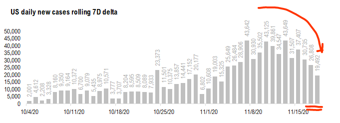
We do not want to be “jumping the gun” but it does look more and more like COVID-19 wave 3 could be slowing. Take a look at the chart below:
– the 7D delta in daily cases has slowed markedly from >43,000 to <20,000
– and daily cases in TX, IL and WI look to be rolling over (see Point #2)
– is wave 3 peaking in the next few weeks?
– this is way ahead of our base case of flu season lasting until mid-Feb
COVID-19 is unpredictable. So daily cases might be slowing in wave 3 states, but it could erupt in the Northeast. So it might be more accurate to say daily cases seem to be rolling over in TX, WI, IL and leave it at that. We wrote about El Paso and TX yesterday. But it seems like it is more states now.

Source: COVID-19 Tracking and Fundstrat
Given the fierce move by equities in the past few weeks, it is not entirely surprising to see stocks consolidate over the last few days. And not surprisingly, there are more than a few who believe markets have become overly exuberant. To an extent, we understand this, as there has been both a sizable move in markets coupled with a sizable rotation into epicenter stocks.
That said, we see tailwinds for P/E into year-end, and while upside to earnings revisions is muted for now (we are done with 3Q2020 EPS), we believe risk premia can fall = P/E expansion. Below are 10 reasons we see this:
1. COVID-19 vaccine and therapeutics take “worst case” off table.
2. Policymakers are pursuing soft-lockdowns, not killing recovery
3. Pent-up demand in US, look at output gap
4. China seeing massive explosive economic recovery
5. Fiscal stimulus coming
6. Investors are cautiously positioned, with little conviction
7. $4.5T cash on sidelines
8. If VIX breaks below 20, double-risk on signal
9. Santa Claus rally
10. Fed dovish
We see S&P 500 reaching 3,800 by year-end (vs 3.525 prior) as P/E expands by 1.4X to 19.7X
With tailwinds for P/E expansion, we see 2021 P/E rising to 19.7X from 18.3X, which would lead to S&P 500 3,800 (based on EPS of $193). This, we are revising our YE target from 3,525 (which we raised on 8/13) and represents about 6.5% upside.
– this is about the magnitude of a typical Santa Claus rally
– so we are saying markets see their typical seasonal gains.

Source: Fundstrat
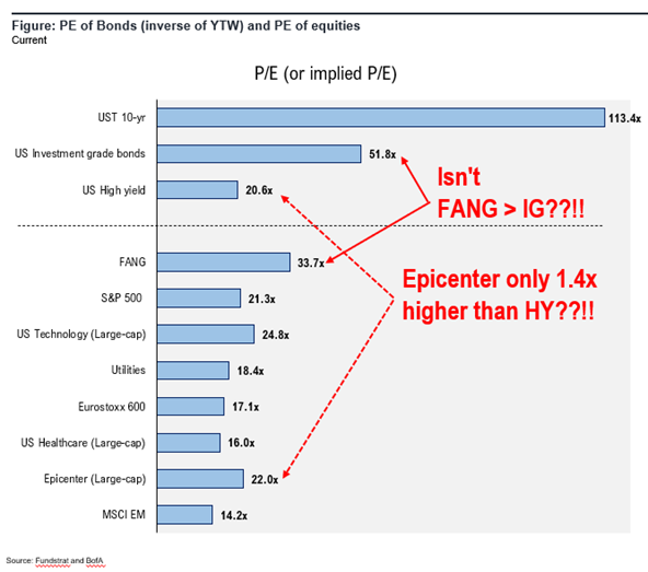
S&P 500 P/E of 19.7X is the same as High-yield implied P/E today… so it is not “demanding”
From a valuation perspective, the target P/E of 19.7X is the same as the high-yield implied P/E (inverse of yield to worst) of 20.6X.
– in fact, it is a discount
– if S&P 500 traded at 20.6X, the S&P 500 would be 3,976
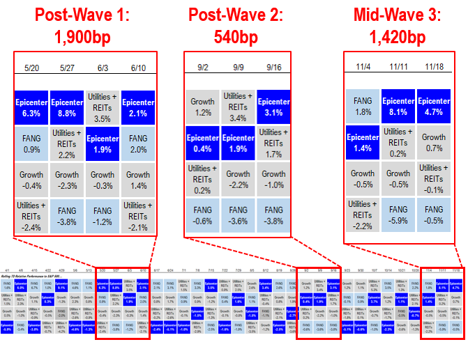
Epicenter stocks rally still weaker than the post-Wave 1 rally…
We have written multiple commentaries about the tailwinds for epicenter stocks, and in particular, how they are the most leveraged to both:
– vaccine/therapeutics –> demand recovery
– economic recovery –> operating leverage via cost cutting
Thus, we see the best risk/reward in the epicenter. And unlike earlier in 2020, there is much greater visibility and tangibility to a vaccine and cure for COVID-19. Thus, the ability for markets to look beyond contemporaneous cases should be much higher. As shown below, post-Wave 1, Epicenter stocks rallied 1,900bp relative to the S&P 500. And the rally was weaker post-Wave 2.
– So far, Epicenter has outperformed by 1,420bp.
– This is a fraction of the 7,000bp of YTD outperformance of Growth
– Thus, we see substantial upside for epicenter stocks.
Source: Fundstrat
ADDENDUM: We are attaching the stock lists for our 3 portfolios:
We get several requests to give the updated list for our stock portfolios. We are including the links here:
– Granny Shots –> core stocks, based on 6 thematic/tactical portfolios
– Trifecta epicenter –> based on the convergence of Quant (tireless Ken), Rauscher (Global strategy), Sluymer (Technicals)
– Biden vs Trump –> based on correlation to either candidate odds
Granny Shots:
Full stock list here –> Click here
Trifecta Epicenter:
Full stock list here –> Click here
Biden White House vs. Trump White House:
Full stock list here –> Click here
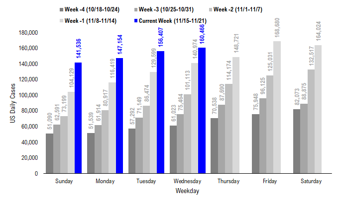
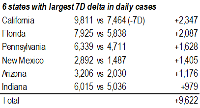
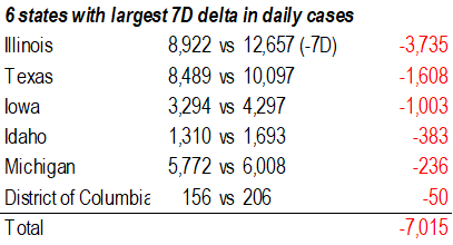
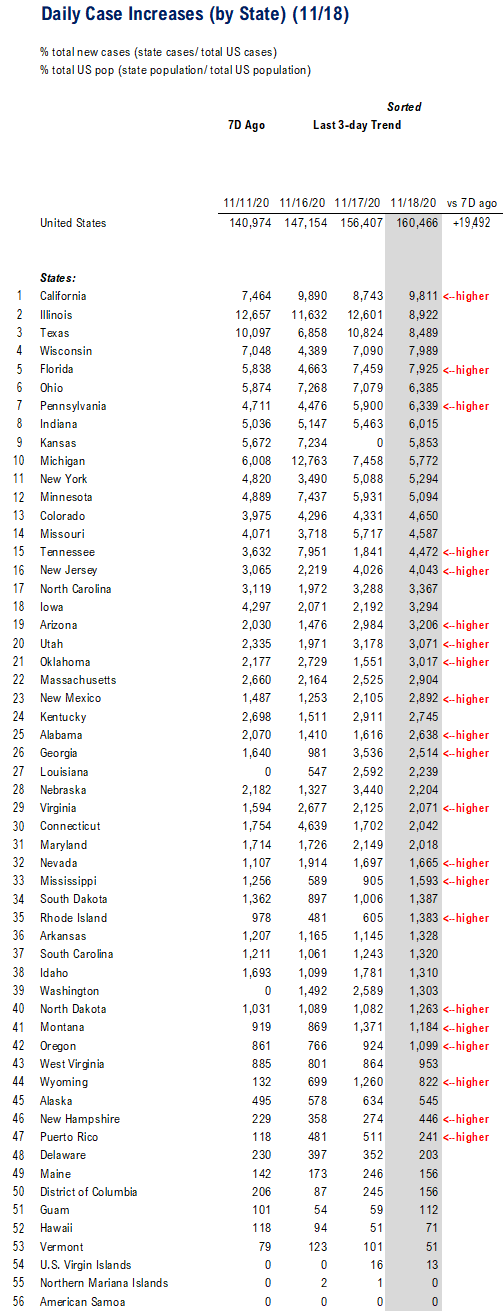
POINT 1: Daily cases 160,466, +19,492 vs 7D ago — the lowest 7D delta in two weeks
The latest COVID-19 daily cases came in at 160,466, up +19,492 vs 7D ago. Wave 3 is still surging.
– But oddly, are cases starting to decelerate on a “rate of change” basis?
– maybe
Source: COVID-19 Tracking Project and Fundstrat
7D delta at 19,492 is the lowest in nearly 3 weeks…
Again, the daily change vs 7D ago, in our view, is the leading indicator as it is what influences the 7D moving average.
– Daily cases are rising vs 7D ago,
– It had been rising at >40,000 7D delta
– But the pace slowed to <20,000 on Wednesday
Source: COVID-19 Tracking and Fundstrat
Source: COVID-19 Tracking and Fundstrat
Source: COVID-19 Tracking and Fundstrat
POINT 2: If Wave 3 is peaking, early signs in WI, IL and TX
Yesterday, we wrote about how it looks like parts of Texas were seeing a peak in cases. And below are the major states involved by their respective waves. If wave 3 is peaking, we believe it is potentially starting in 3 states:
– IL –> seems rolling over
– TX –> we wrote yesterday about El Paso
– WI –> squint… looks like it is rolling over
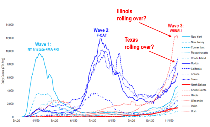
Source: COVID-19 Tracking Project and Fundstrat
This is the chart showing daily cases per 1mm in the 6 largest counties in Texas. And El Paso stands out because it looks like cases are finally rolling over.
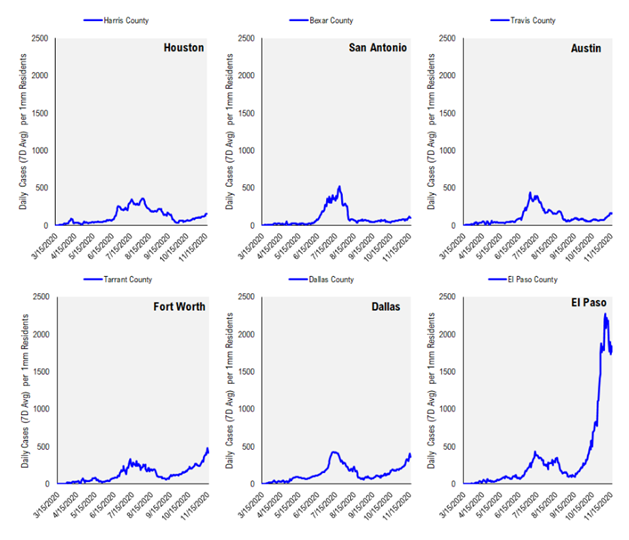
Source: Johns Hopkins and Fundstrat
Again, looking at Illinois, it does look like this surge associated with Wave 3 could be plateauing… that is a good sign.
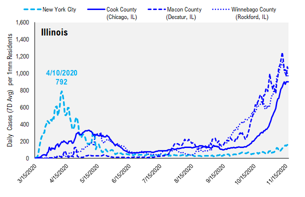
Source: Johns Hopkins and Fundstrat
And again, I might say that Wisconsin also looks like daily cases are starting to roll over…
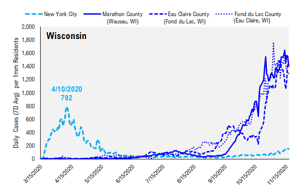
Source: Johns Hopkins and Fundstrat
POINT 3: Age 60+ is now the largest share of new cases, a bad sign for future mortality
The CDC provides data on demographic trends in COVID-19. The data is somewhat lagged, due to reported delays and the latest update is as of 11/3/2020, or about two weeks ago. But the extracted data, particularly around the share of cases, is still relevant.
Below shows the share of cases (trailing 30D) based on age groups. This is important because we know of the sizable variances in mortality risk (case fatality rate) between age groups:
– Wave 1, ~35% of cases were age 60+ which explains the extremely high mortality rates
– Wave 2, the plurality of cases were age 20-29
– Wave 3, so far, age 60+ is now the largest share of cases at ~21%
This wave is underway, but this also suggests that death rates could exceed that of Wave 2, simply because of the higher share of older Americans.
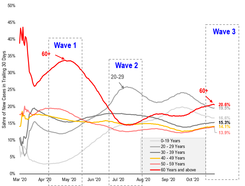
source: https://data.cdc.gov/Case-Surveillance/COVID-19-Case-Surveillance-Public-Use-Data/vbim-akqf
This chart below shows the case fatality rate by age, based on data from Our World in Data. And as shown, there is a sharp rise in mortality based on age.
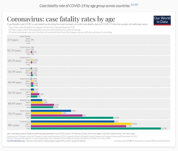
https://ourworldindata.org/mortality-risk-covid
For the US specifically, Statista has this data, collected from the CDC and also shows considerably higher mortality for older Americans.
– in round numbers, if wave 2 was primarily 20-29, the mortality rate (case fatality rate) was 0.1% but age 60+, this jumps to 2.7% or higher
– thus, mortality risk remains high unless the standard of the case has improved
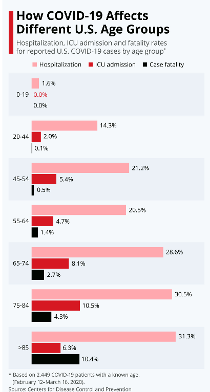
https://www.statista.com/chart/21173/hospitalization-icu-admission-and-fatality-rates-for-reported-coronavirus-cases/
RANDOM: Chart shows Wave 3 surge is similar to US corn production — someone called it “cornvirus”
I wanted to share this tweet from @EthicalSkeptic. This account often comments on COVID-19 with sometimes interesting facets of the pandemic. But this tweet below caught my eye.
– @ethicalskeptic points out that corn production in the US looks similar to wave 3 of COVID-19
– I especially found “cornvirus” to be funny
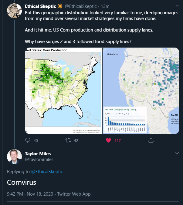
Source: twitter.com
The two images below make it clearer. I have no idea why these two charts look so similar. If you have a view, please let me know
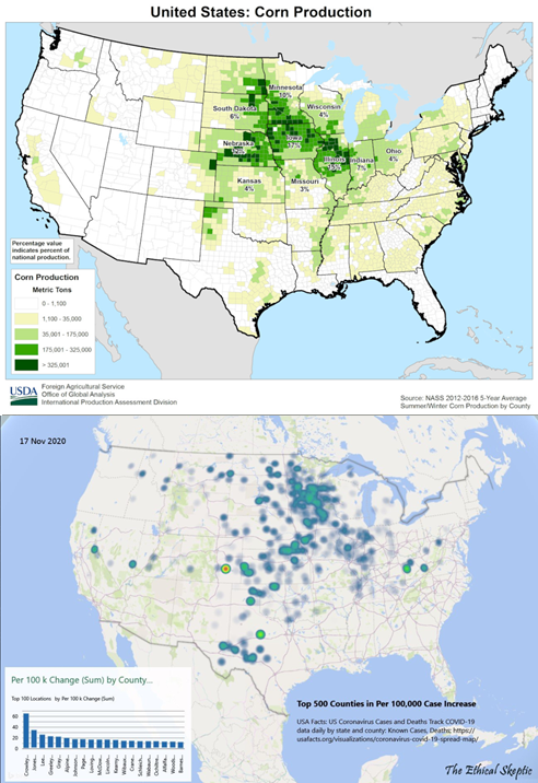
Source: twitter.com