


Tom Lee recently explained why the yield curve inverting is an important signal and why many investors may be misinterpreting this signal. Tom Lee highlights the significance of the brief yield curve inversion for equities and what role unusual inflation expectations may have had in its occurrence. The full report is here.
As the Federal Reserve and Chairman Powell have begun to provide signals that they are about to begin a tighter monetary policy to combat recent inflation readings that have been rising, the “the yield curve” has started getting more and more mentions by the financial press, economist, and other Wall Street talking heads. For many not working in the financial markets, the phrase yield curve and related concepts can be confusing. Thus, we wanted to provide subscribers a brief primer to make sure you understand what it is, why you are hearing about it so much, and why it can provide useful signals for the economy, sector positioning, and individual stocks.
You’ve probably heard in the financial media that the yield curve briefly inverted yesterday. Normally, longer-dated maturities have higher rates because the chance of repayment is lower the more time debt is outstanding, as more can go wrong. An inversion of the yield curve means at least one longer-dated maturity has a lower yield than a shorter-dated maturity. So, when the 2-year yield is higher than the 10-year yield, this can suggest abnormal volatility or headwinds for growth are ahead in the short term. In normal times, longer-dated maturities should have higher yields.
The Yield Curve refers to the term structure of US government debt. Term structure simply refers to the rates of bonds of similar or the same quality across different maturities, either in a table or a graph. Since the risk-free rate (or what you could earn on your money without taking risk) is a vital component of many valuation methods, the proxy for this rate is incredibly important for financial markets. Since US government debt is considered the world’s safest asset, various maturities of US debt assume this vital function for many different types of valuation models for both equities and derivatives.
Very simply put, the yield curve shows yield as a function of maturity for debt instruments. On a graph, the yield curve has maturity on the x-axis and yield on the y axis. The yield on the 10-yr treasury can be thought of as the yield on the 1-yr note, plus nine years of the expected rate. Thinking of the curve in this way can help interpret the signal this vital indicator can provide.
The yield curve can be confusing, but we want to give you a brief primer to make sure you understand what it is and why it can provide a valuable signal for stocks. You’ve probably heard in the financial media that the yield curve briefly inverted yesterday. This always gives the top-calling crowd ample ammunition, and many will tell you the yield curve inversions are a leading indicator that predicts recessions.
The chart below shows how when the spread between the 2 years and 10 year (a.k.a. the “2s10s spread”) has inverted, it has indeed presaged past recessions. For this reason, when inversions occur, they are considered a “death touch” for economic expansions. Therefore, the inversion of this crucial indicator gets a lot of attention when it happens. However, it is also helpful to remember that inversions of the 2s10s spread, in particular, have been overly sensitive and have “predicted” 10 of the last 6 recessions since 1976. Inversions are highlighted below in yellow.
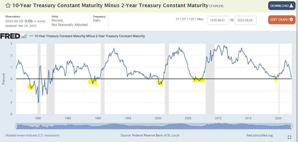
There is disagreement amongst those in the know just exactly why this inversion has predictive value. Purists contend that markets are efficient and provide better information than any one of us can on our own. Some will even claim that the yield curve accurately predicted the recession caused by COVID-19. We find this somewhat unlikely and think there’s a more nuanced reason why the curve inverts and why this can often signal upcoming trouble for financial markets.
Some believe the curve predicts Fed efforts to tighten and rein in inflation. The correlation to economic outcomes is coincidental. Instead, they believe the power of the yield curve is to predict the Fed Policy Cycle. However, the economic significance of the Federal Reserve explains why the indicator seems to presage recessions. It is not the recession being predicted but aggressive Fed action that has a high likelihood of potentially causing a recession.
It’s All in The Shape
While the 2s10s spread is a widely used indicator to reflect short-term versus long-term growth expectations, it is not the only one. The 10-yr minus the 3-month T-bill, for instance, should provide a similar signal, but that spread has steepened since the year began and is still signaling economic growth ahead. Hanging your hat on one indicator is never wise. This spread has predicted the same recessions the 2s10s spread has in the past, but it is not predicting one now. The 10-yr minus the Fed Funds rate is another indicator not signaling recession at this point.
The 2-yr is generally used as a proxy for the short-end of the curve because it will be more sensitive to short-term changes the Fed is undertaking or planning to undertake. The longer end of the curve can be more or less sensitive or more sensitive to changes depending on the long-term expectations of the Federal Funds rate.
An ascending yield curve generally means that investors expect short-term rates to rise over time. Investors demand higher yields for having their money tied up in long-term bonds. So, the upward-sloping curve shape indicates that markets expect rising interest rates and, by proxy, economic growth. An ascending curve is associated with positive economic expectations. When the curve steepens because of the expectation that the Fed will soon lower rates, this is called a Bull Steepener. The curve can also steepen when long-term rates rise faster than short-term rates because of heightened inflation expectations. This is called a Bear Steepener since it suggests the Fed will be tightening to fight inflation.
A flat yield curve at face value should indicate that investors expect rates to remain relatively stable. The curve also tends to flatten around a Fed tightening cycle, which we just started this month. This is a Bear Flattener because the curve signals that short-term rates are about to rise, which is a headwind for the economy and stocks. This can happen when the Fed raises the Fed funds rate, but long-term yields don’t go up in tandem. Some explain this type of flattening as a signal that fixed income markets fear Fed tightening could be too aggressive and may cause a recession. A Bull Flattener can occur because the change in the yield curve could be flattening in anticipation of the Fed lowering short-term rates, which is good for economic activity.
An inverted yield curve suggests investors want to lock in their long-term yields before they go down. The downward-sloping yield curve tends to happen when investors believe Fed tightening activity is in danger of causing a recession. It could be thought of as the expectation that the Fed’s tightening will likely lead to recession. In other words, the signal from a downward sloping yield curve may be that investors feel rising short-term rates will curtail favorable economic conditions and growth.
So, we urge you not to hit the sell button just because the yield curve inverted. The picture is always complicated, and this helpful indicator should always be used in conjunction with other indicators and data to verify or back up the signal. The chart below shows the yield curve change from the beginning of 2022 until the end of March. The yellow dotted curve is from January 1st, 2021, and the green solid one is from March 30th, 2022. The bars are the change in each maturity over that period.
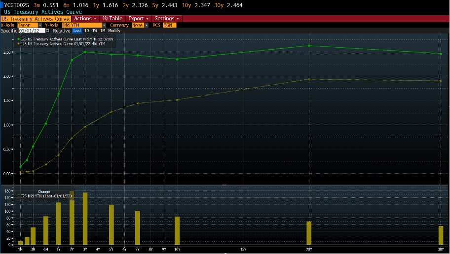
As you can see, despite the brief inversion that occurred on March 29th, the ascending slope of the whole curve is still intact. Other similar indicators like the spread between the 10-yr and the 3-month have expanded over the period. Our Head of Research, Tom Lee, has just released a detailed note about why he thinks the 3/29 inversion should be taken in full context rather than being used as an excuse to panic or sell. As you can see, the general shape of the yield curve is still ascending despite ample reasons to fear a recession.